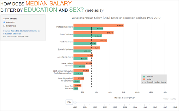
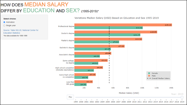
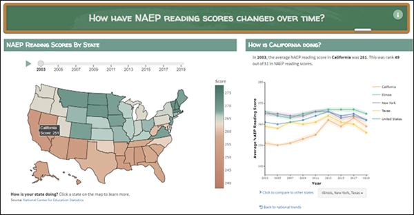
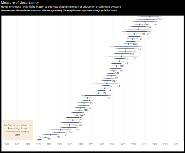
The National Institute of Statistical Science sponsored a second SAID (Statistically Accurate Interactive Displays) in Graphics student data visualization contest this Spring, 2022. (see Event page) The purpose of this contest was to create exceptional examples of interactive data visualization techniques of data presentations in public reports about education demonstrating how these can intrigue and provoke readers into deeper engagement with the information contained in these reports.
The competition was open to graduate and undergraduate students at a US or Canadian institution of higher education. Entries were accepted from teams of up to five students and from individuals where teams could submit up to two graphics for the same or different data sets.
The data for the contest was selected in conjunction with NCES from the Digest of Education Statistics from the National Center for Education Statistics. There were five choices of data to select for the contest that presented different types of data (including geographic and longitudinal) that also included different types of variables.
The interactive graphics were designed to communicate with the public by grabbing the readers’ attention, enticing them to interact with the data, and leading them to more deeply investigate the substantive questions addressed by the data. The target audience of the graphics included parents, educators, policy makers, and researchers.
The 2022 SAID in Graphics Contest received 39 entries from Graduate and Undergraduate students in the US and Canada. The entries examined the data either over-time or geographically, or both! The judges for the contest included Nola du Toit from the NORC-University of Chicago, Heike Hoffman at Iowa State University, and Haley Jeppson a current NISS Research Associate. The contest was organized and managed by Brian Habing, NISS Associate Director for Education Activities and Research. This year, just as last year, the submissions gave the judges much to discuss! The judges extend a sincere thank you to all the individuals and teams that submitted entries included everything from the very interesting and precise to the exceptionally innovative!
After much deliberation the judges made the following selections: an Overall winner, a 2nd place entry that focused on having an inviting opening screen, as well as a 2nd place entry that focused on uncertainty. Furthermore, due to the number of innovative and exceptional entries that were submitted the judges also selected a Judges Choice Honorable Mention entry!
Below are the award recipients for this year's contest. Sample images of their entries are displayed below. Click on the images to enlarge.
Award Recipients
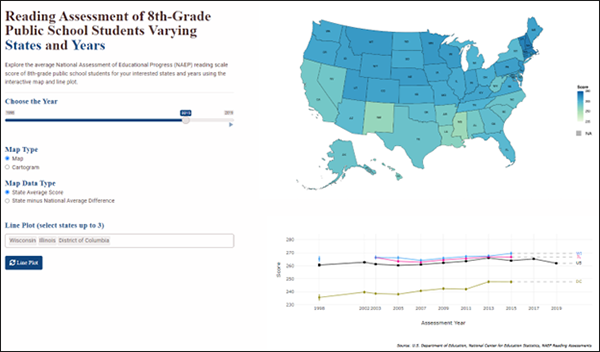
1st Place Overall
Logan Kocka at Miami University in Ohio who was completing a BS in Biomedical Engineering over the spring, and has moved on to graduate school at Notre Dame.
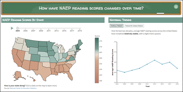
2nd Place (for Best Entry Page/Most Inviting Opening Screen)
Emily Flanagan, Melody Huang, and Tiffany Tang all from the Ph.D. Program in Statistics at University of California, Berkeley
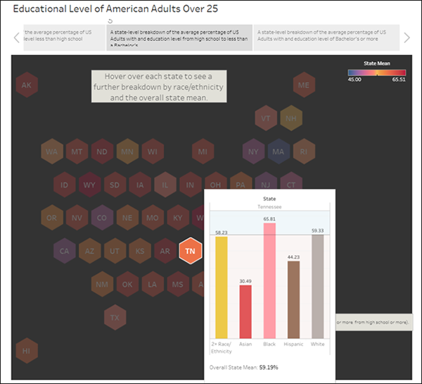
2nd Place (for Best Presentation of Uncertainty)
Thu Trang Nguyen, Jana Turner, and Jiaxuan Yang pursuing B.S. degrees in Business, Computer Science, Mathematics, and Economics at Rhodes College.
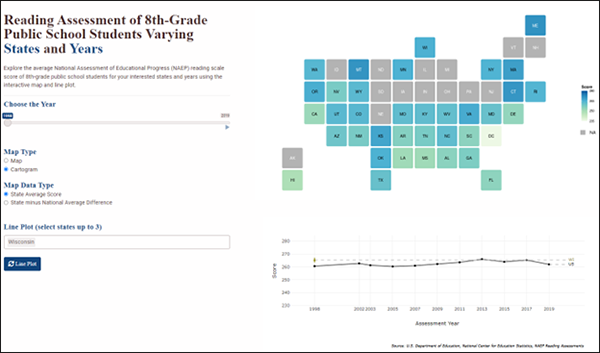
Judges Choice Honorable Mention
Yi Chen Ph.D. in the Department of Biostatistics and Medical Informatics at University of Wisconsin-Madison.
Want More Information?
If you're planning to be at JSM in Washington, D.C. this summer, there will be more on the contest entries and the entrants' insights. Please feel free to visit with us at Session 287 "Student Insights into Graphical Innovation for Educational and Government Reports" on Tuesday the 9th at 10:30 AM. For more on visualizations for government reports, sign up in advance for Round Table 211 "Combining Visualization Best Practices with Agency Standards for Statistical Graphics in Government Reports" on the 9th at 7:00 AM (with breakfast). We would enjoy hearing from you!

