[Please Note: The 2020-2021 competition has come to a close and the judges have made their decisions. The winners of the first contest can be found below.
Information about the Spring 2022 competition can be found following the link below:
The Spring 2022 NISS SAID in Graphics Competition is now Open!!
NISS is pleased to announce the graduate student winners of the 2020-2021 SAID in Graphics Data Visualization Contest!
SAID in Graphics challenged entrants (individuals and interdisciplinary teams) to bring data to life for a wide public audience, using interactivity and clever graphics to attract attention while expanding insights from data about education. New takes on classic statistical graphics as well as some more contemporary approaches were designed to entice viewers starting from the first screen to “ask the next question.”
The 68 individual and 10 team registrants resulted in 14 individual and 10 team completed entries. Judging was based on the accuracy of the visual impression, how it addressed a question of educatonal interest based on the motivating report, and its accessibility and attraction for a wide audience. The judges were Nola du Toit at NORC, Jonathan Schwabish at the Urban Institute and Lee Wilkinson at H2O. Winners’ university home departments received the cash awards on behalf of all the winning participants.
1st Place Team
Kevin Bryant - Department of Statistics, Penn State University
Dannielle Moriondo - Department of Communications, Westminster College
(click images to enlarge)
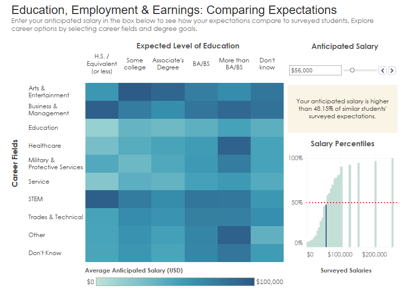
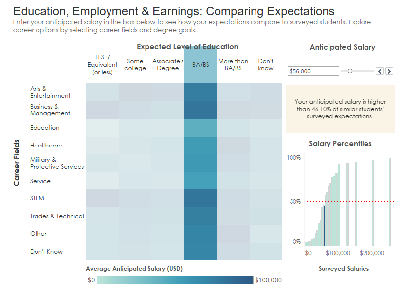
This team’s entry was based on the 2021 NCES online report, ”Education, Employment, and Earnings: Expectations of 2009 Ninth Graders in 2016” and used data specifically subsetted and modified for this contest. This graphic coupled a heat map with associated cumulative frequency histograms. In particular, it received high praise for the easy entry into the graphic, allowing the viewer to find more detail by picking their own career or the expected level of education or a desired (anticipated) salary, then to make a different choice or to specify all three.
From the Judges...
"This is a clever application of a Tableau dashboard. A good part of its cleverness is that it doesn't look like a dashboard."
"Especially valuable is the integration of story-telling with the graphs themselves."
1st Place Individual
Jingyi An – Department of Data Science, Columbia University
(click images to enlarge)
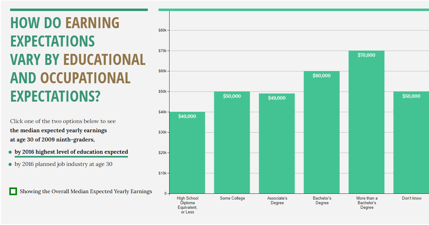
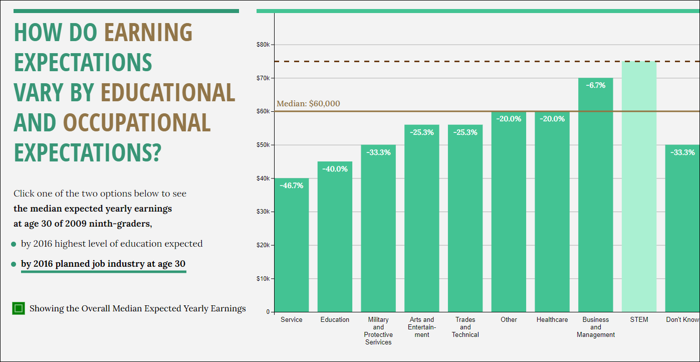
This entry was also based on the 2021 NCES online report, ”Education, Employment, and Earnings: Expectations of 2009 Ninth Graders in 2016” and used the same data specifically subsetted and modified for this contest. This graphic presented an elegant histogram that is immediately accessible, and invites the viewer to ask about both industry and education as they impact expected earnings for these same students in another seven years.
From the Judges...
"So good! So clear, so simple, so pretty."
"The layout and headers and text are very good and support the graphic."
Judges Choice Award
Maria Haji-Georgi, Oxana Rosca, Ching-Yen (Elie) Yu, and Xinyun Xu – Department of Educational and Counseling Psychology, The State University of New York at Albany
Falon Treis - Department of Geography and Planning, SUNY Albany
(click images to enlarge)
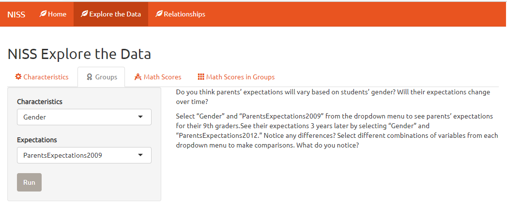
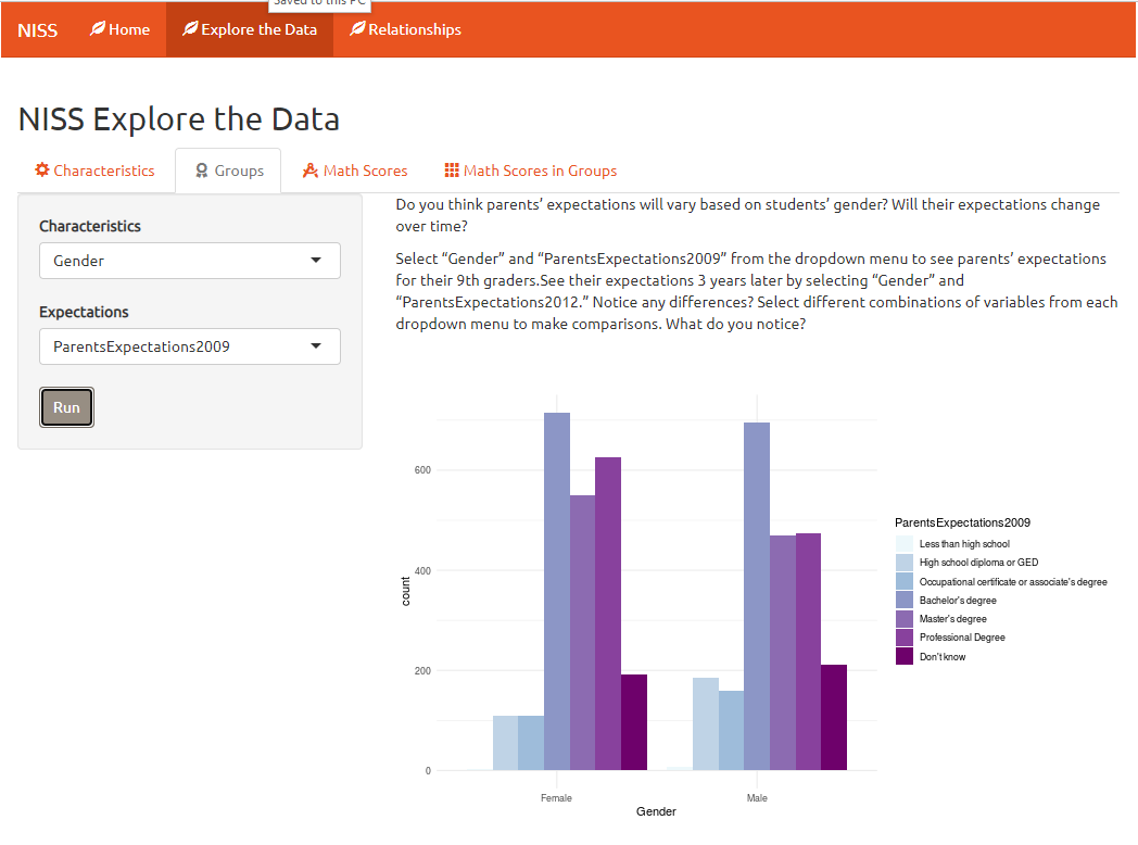
This team chose a different NCES online report, “Parent and Student Expectations of Highest Education Level” and used data specifically subsetted and modified for this contest. This graphic was singled out by the judges for its immediacy in communicating with viewers. First, the information on its opening screen and then its use of explanatory prompts encouraged viewers to “keep turning the page” to get the full story.
From the Judges...
"This shiny app is thoughtful, very user friendly, and would appeal to a large audience."